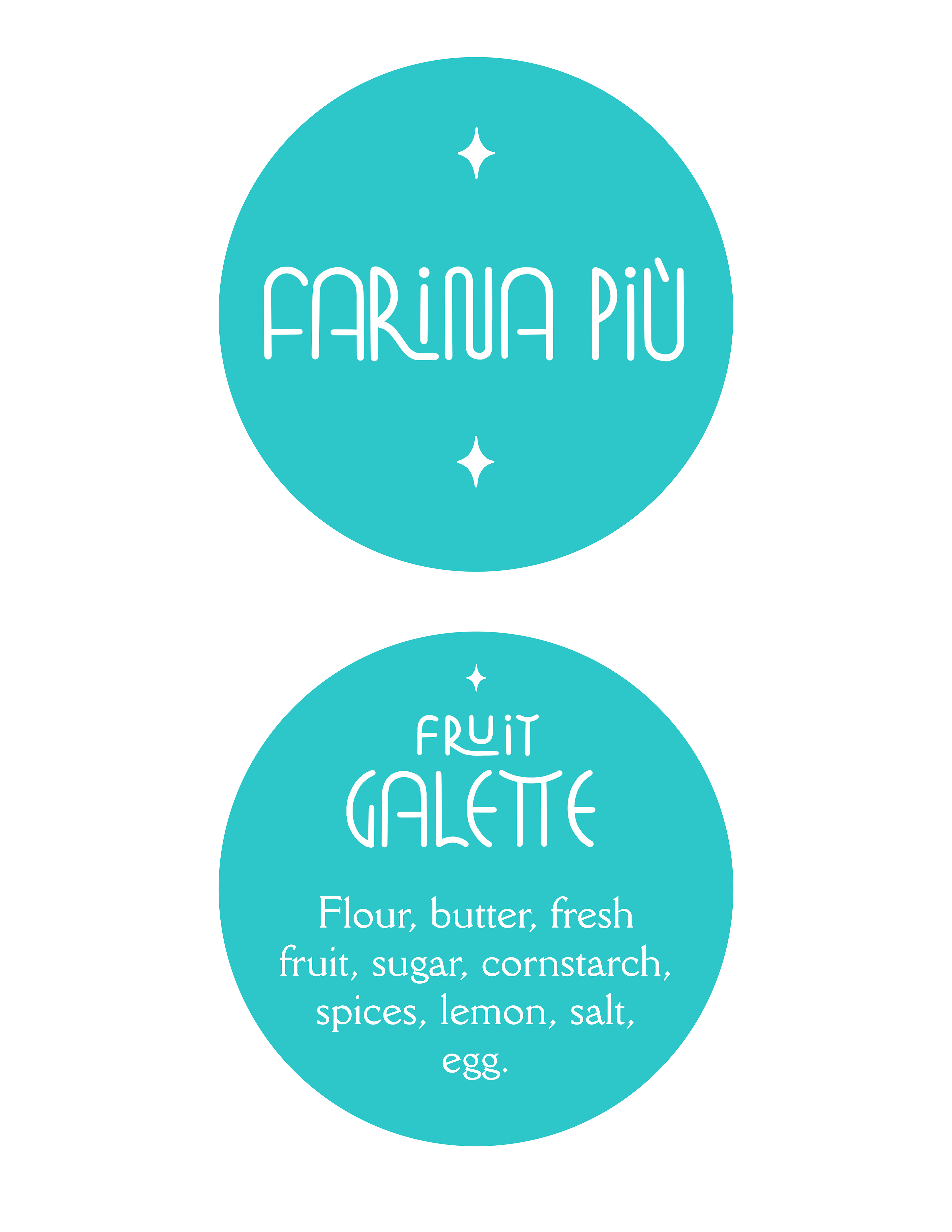
Designed for my pop-up bakery during the first pandemic summer in 2020. I wanted a logo that popped, with a light, carefree tone and highly legible text—both for the bakery's title (already a little unfamiliar-sounding) and the ingredient list. Both "Farina Più" and "Fruit Galette" were hand-drawn in Procreate with a loopy, inviting feeling; the ingredient list's typeface is DellaRobbia. I added rhombus-shaped stars with a slight bevel, also hand-drawn, above and below the title to fill the blank space and also direct the reader's eye to the text. The deigns were ultimately printed onto sticker paper and pasted on the box of every galette I sold.